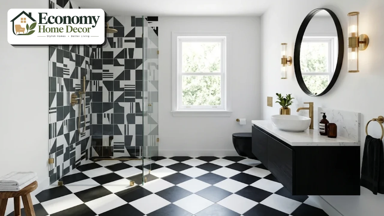
Some bathrooms whisper. Others make a statement the moment you open the door, with a black-and-white checkerboard floor, a wall of bold geometric tile or wallpaper with sharp, confident stripes.
A graphic bathroom belongs firmly in the second group. It uses strong contrast, clean lines, and bold patterns to create an energetic room.
Modern and full of personality. Because bathrooms are small and used briefly, they’re one of the best places in the home to try a daring look.
The trick is making graphic design feel intentional, not chaotic. Done well, it looks crisp and stylish. Done badly, it can feel busy and dizzying.
This guide explains what makes a bathroom graphic, the key design principles, 20 ideas for tile, wallpaper, paint and fixtures, how to mix patterns, color palettes, small-space tips, real-world examples and mistakes to avoid.
What Is a Graphic Bathroom?
A graphic bathroom relies on bold visual elements rather than soft, subtle decor. It usually features:
High contrast, often black and white, though bold color pairings work too.
Strong geometric patterns, such as checkerboards, stripes, chevrons, hexagons, and arches.
Clean, crisp lines in tile, paneling,g and fixtures.
Simple, sculptural fixtures that don’t compete with the pattern.
A clear focal point, such as a patterned floor or feature wall.
The look draws on several design movements, including Art Deco, mid-century modern, Memphis design,gn and contemporary minimalism. What they share is confidence: shapes, lines, and color take center stage.
Why Choose a Graphic Bathroom?
It’s memorable. Bold pattern gives a room instant personality.
It’s affordable to try. Small rooms need less tile, paint, or wallpaper.
It hides wear. Patterned floors disguise water spots, dust,t and small marks.
It suits many styles. From classic black and white to playful color, the look adapts.
It feels current. In Fixr’s 2026 trend survey, 75% of designers said all-white and all-gray bathrooms are on their way out, and bold pattern is one way to move beyond them.
Key Design Principles
Before choosing tile or wallpaper, keep these principles in mind.
Pick one hero
Choose one main graphic feature, such as the floor, the shower wall,ll or wallpaper, and let it be the star. Keep the rest of the room simpler.
Limit the palette
Two or three colors are plenty. Black and white is classic; navy and white, green and cream, or terracotta and white are softer alternatives.
Play with scale
Large patterns can make a small room feel bigger and calmer, while small patterns feel busier. Mixing two patterns works best when one is large and the other small.
Repeat colors
Echo the pattern’s colors in towels, hardware, frames,mes or a vanity. This ties the room together.
Balance with plain surfaces
Every bold pattern needs breathing room. Plain walls, a solid vanity, or a simple mirror let the graphic element shine.
20 Graphic Bathroom Ideas
These ideas range from small touches to full-room statements.
Classic black and white checkerboard floor
The checkerboard floor is the definitive graphic feature. Large 12-inch squares feel modern, while smaller tiles feel vintage. Lay them on the diagonal to make a narrow room look wider.
For a softer version, try charcoal and warm white instead of pure black and bright white. The contrast stays strong, but the room feels a little gentler.
Checkerboard in color
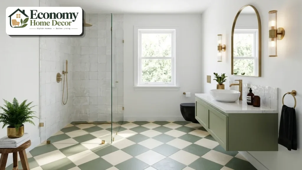
Swap black and white for softer combinations like sage and cream, terracotta and white, or navy and sky blue. It keeps the graphic punch with a warmer mood.
Colored checkerboards pair beautifully with brass fixtures, wood vanities, and plants, and they suit cottage, Mediterranean, and modern homes alike.
Bold geometric cement tiles
Encaustic or cement-look tiles in star, diamond,d or interlocking patterns create a rich, graphic floor. Porcelain versions offer the same look with less maintenance.
Real cement tiles are porous and need sealing, so porcelain is usually the easier choice in busy family bathrooms. Keep the walls plain so the floor can shine.
Hexagon tile
Black and white hexagon tiles, or large hexagons in a single bold color, add geometry without feeling overwhelming. A floral hex pattern, with a black tile surrounded by white, is a timeless classic.
Small mosaic hexagons offer plenty of grout lines, which add grip underfoot, making them a smart choice for shower floors as well as main floors.
Stripes on the floor
Alternating bands of black and white tile, or a single stripe border, make a strong statement. Stripes running the length of the room make it feel longer; stripes across make it feel wider.
A single black stripe running around the room at chair-rail height is a subtle way to add a graphic line without committing to a full pattern.
Herringbone and chevron
Herringbone or chevron tile in high-contrast grout adds movement. Use it on the floor or as a shower feature wall.
Wood-look porcelain in herringbone adds warmth, while black and white marble-look tile in chevron feels glamorous and bold.
Graphic shower wall
Make the shower wall the hero with a bold patterned tile, while keeping the rest of the walls plain. The pattern is framed by glass and draws the eye immediately.
Use a clear glass panel rather than a curtain so the pattern stays visible, and run the tile all the way to the ceiling for maximum impact.
Contrasting grout
Simple white subway or square tiles become graphic with dark charcoal or black grout. It’s an affordable way to add strong lines.
Use epoxy or high-quality cement grout in a dark color, which hides stains better than light grout and keeps lines crisp.
Vertical stacked tile
Long, narrow tiles stacked vertically create a crisp, linear look and make ceilings feel taller.
This approach works especially well in small bathrooms because it draws the eye upward and adds structure without a busy pattern.
Arches and curves
Arched niches, an arched mirror, or tile laid in a fan or scallop pattern softens a graphic room while keeping strong shapes.
Our guide to bathroom design floor ideas explains which tile materials are safest for patterned floors. Choose tile with a wet DCOF of at least 0.42, the common benchmark in the ANSI A326.3 standard for level interior floors that get wet.
Bold striped wallpaper
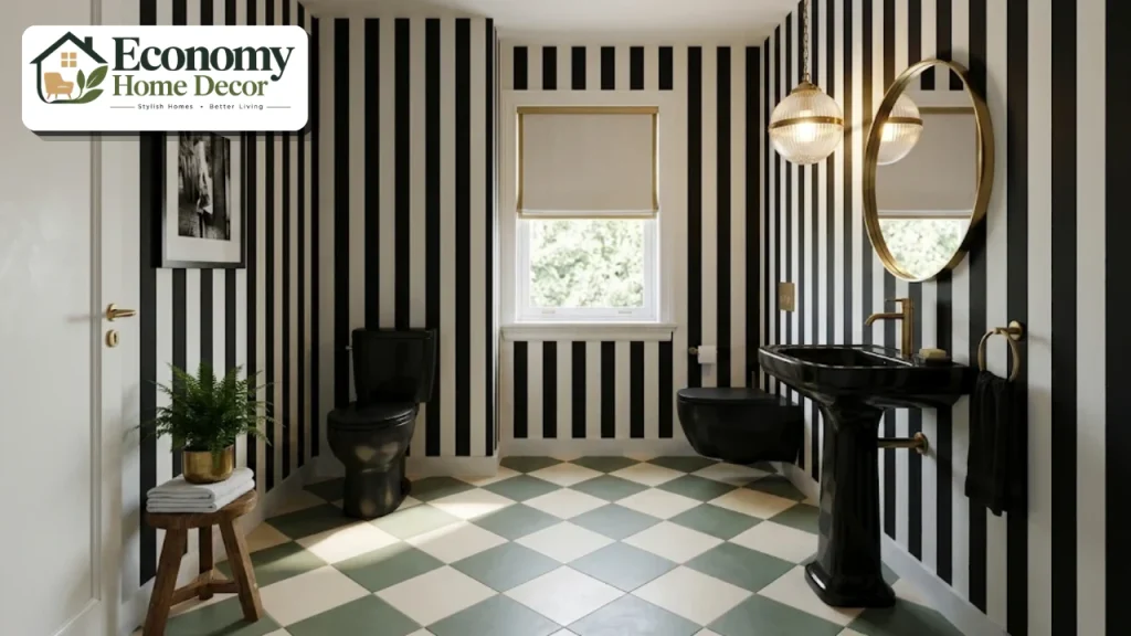
Wide black and white stripes, or stripes in a bold color, add instant drama to a powder room or the dry walls of a bathroom. Choose a washable, moisture-resistant vinyl paper.
Pair striped walls with a plain floor and simple fixtures, so the room feels dramatic rather than dizzying.
Geometric wallpaper
Triangles, diamonds, grids,s or Art Deco fans make a strong statement. In a small bathroom, one papered wall is often enough.
The wall behind the vanity or toilet is usually the best spot, because it’s seen first and stays relatively dry.
Painted color blocking
Paint the lower half of the walls in a bold color with a crisp line, or create a painted arch behind the mirror. It’s an affordable, graphic upgrade.
Use painter’s tape and a level to get crisp lines, and choose a moisture-resistant satin or semi-gloss finish.
Painted stripes or patterns on the ceiling
A striped or patterned ceiling adds surprise without crowding the walls, especially in powder rooms.
Black fixtures
Matte black faucets, shower frames, mirror frames,es and towel bars add crisp outlines that suit graphic designs perfectly.
Black-framed shower glass
Steel-look black-framed glass panels create a strong grid pattern, adding an industrial, graphic edge.
Bold vanity color
A black, navy, emerald, or bright red vanity gives the room a graphic focal point against white tile.
Match the hardware to your faucet finish and keep the countertop simple, such as white quartz, so the color reads clearly.
A sculptural mirror
Round, arched, pill-shaped,d or asymmetrical mirrors add shape and contrast against patterned walls.
A thin black or brass frame outlines the mirror crisply and ties it to the rest of the fixtures.
Graphic textiles
Striped or geometric towels, a patterned bath mat or a graphic shower curtain let you test the look before committing to tile.
Textiles are also the easiest way to refresh the look later, by swapping colors with the seasons.
Graphic art
Black and white photography, abstract prints, or typography posters in simple frames complete the look.
Choosing Tile for a Graphic Bathroom
Tile is the backbone of most graphic designs, so choose carefully.
| Tile type | Graphic look | Pros | Things to know |
|---|---|---|---|
| Porcelain | Checkerboard, geometric, large format | Durable, low maintenance, water-resistant | Choose slip-resistant finishes for floors |
| Cement | Rich, encaustic patterns | Beautiful, handmade character | Needs sealing, can stain |
| Ceramic | Subway, hexagon, wall patterns | Affordable, wide choice | Best for walls and light-traffic floors |
| Mosaic | Hexagons, pennies, small geometrics | Grip underfoot, flexible design | More grout to clean |
| Terrazzo | Speckled, playful | Durable, unique | Can be costly |
Order a few extra boxes for cuts and future repairs, and lay out a sample section before installation to check how the pattern lines up with the walls, doorway and fixtures. In graphic designs, a pattern that’s slightly off-center is far more noticeable than in plain tile.
Color Palettes for Bold Pattern
| Palette | Mood | Works well with |
|---|---|---|
| Black and white | Classic, crisp | Brass or chrome fixtures, wood accents |
| Navy and white | Fresh, nautical | Brass, natural wood |
| Green and cream | Calm, vintage | Brass, rattan |
| Terracotta and white | Warm, Mediterranean | Black fixtures, plants |
| Pink and red | Playful, bold | Brass, white fixtures |
| Charcoal and blush | Soft, modern | Matte black or brushed gold |
| Yellow and black | Energetic, retro | Chrome, white |
Start with the main pattern’s colors, then add one accent metal and a natural material like wood or plants to keep the room from feeling cold.
How to Mix Patterns
Mixing patterns can look sophisticated if you follow a few simple rules.
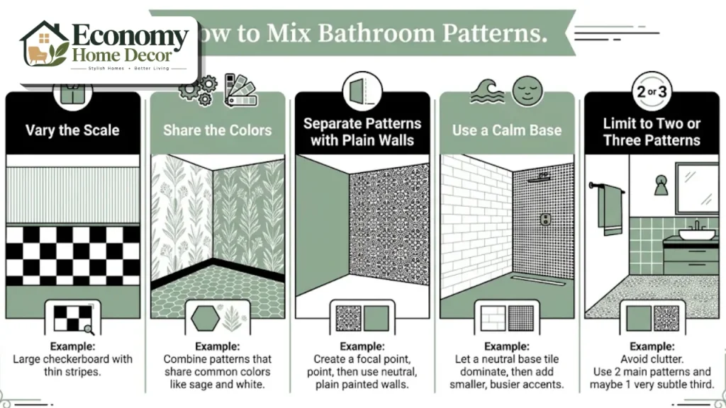
Vary the scale. Pair a large pattern with a small one, such as a large checkerboard floor with fine pinstripe wallpaper.
Share the colors. Patterns in the same two or three colors look like they belong together.
Separate them. Put one pattern on the floor and another on a different wall, with plain surfaces in between.
Use a calm base. Plain white or solid-color walls give the eye somewhere to rest.
Limit to two or three patterns. More than that usually feels busy.
Our post on Cecil’s bathroom design tips shows how to combine pattern and color with confidence.
Graphic Bathroom Ideas for Small Spaces
Small bathrooms and powder rooms are perfect for graphic designs.
Use large-scale patterns to make the room feel bigger.
Run the same patterned tile across the floor and into the shower for a seamless look.
Choose a floating vanity to show more of a patterned floor.
Keep walls plain if the floor is bold, or vice versa.
Add a large mirror to reflect light and pattern.
For more compact-room ideas, browse our small-space solutions section.
Balancing Bold Pattern With Warmth
High-contrast patterns can feel cold if every surface is hard and stark. A few softer elements keep a graphic room welcoming.
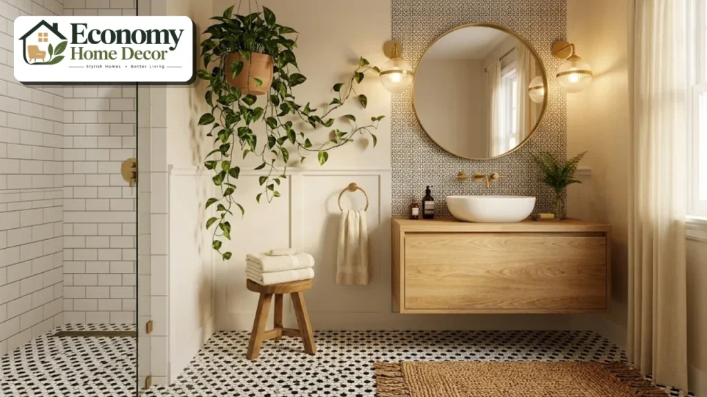
Natural wood. A wooden vanity, stool, shelf,f or mirror frame warms up black and white tile.
Brass or bronze. Warm metals soften strong contrast better than chrome alone.
Plants. Green leaves add life and an organic shape against crisp geometry.
Soft textiles. Thick cotton towels, a woven bath mat, and a linen shower curtain add texture.
Warm lighting. Bulbs around 2700 to 3000K keep white surfaces from looking clinical.
Rounded shapes. An arched mirror, a round sink or a curved vanity balances straight lines.
The aim is contrast with comfort: a room that feels bold the moment you walk in, but relaxing once you’re inside. In Fixr’s 2026 survey, 42% of designers named biophilic design as a rising trend, and plants are one of the simplest ways to bring it into a graphic room.
Styles That Suit Bold Pattern
Graphic design adapts to many styles.
Modern graphic
Large-format black and white tile, matte black fixtures, and a floating vanity. Our guide to modern bathroom styles compares 12 looks.
Art Deco
Fan patterns, geometric tile, brass fixtures, and bold contrast. Pair with a round mirror and a statement light. See our luxury interiors ideas for glamorous finishes.
Vintage and retro
Hexagon floors, checkerboard tile, pastel colors and chrome fixtures recall classic bathrooms of the past.
Scandinavian graphic
White walls, light wood and a single black and white patterned floor keep the look calm. See our Scandinavian style section.
Modern farmhouse
Black and white patterned floor tile, white shiplap and matte black fixtures. Explore our farmhouse decor guide.
Minimal graphic
Plain surfaces with one sharp graphic element, such as a black stripe or a single geometric wall. Our minimalist interiors guide shows how restraint can be striking.
Three Real-World Examples
These everyday situations show how a graphic bathroom comes together in real homes.
A black and white family bathroom
A large black and white checkerboard floor runs throughout, with plain white subway tile on the walls and black grout. A white vanity with black hardware, a round black mirror, and striped towels complete the look.
The pattern hides everyday wear, making it practical for children.
A bold powder room
Wide black and white striped wallpaper covers all four walls. A small black pedestal sink, a brass mirror and a single pendant light create a dramatic jewel box.
Because the room is small and dry, the bold pattern feels exciting rather than overwhelming.
A colorful graphic en-suite
A sage green and cream checkerboard floor pairs with a green vanity and white zellige tile. Brass fixtures and an arched mirror soften the strong lines.
Plants and a wood stool add warmth.
Planning Your Graphic Bathroom
Choose your hero feature. Floor, shower wall,l or wallpaper.
Pick a two- or three-color palette.
Select the pattern scale to suit the room size.
Keep supporting surfaces simple.
Choose fixtures in one finish that echoes the palette.
Plan good lighting so patterns look crisp, not shadowy.
Add textiles and art that repeat the colors.
Good lighting matters when patterns are bold. Sconces on both sides of the mirror and warm bulbs around 2700 to 3000K keep bold patterns looking sharp.
A properly sized exhaust fan, about 1 CFM per square foot for bathrooms under 100 square feet, protects wallpaper and paint from moisture.
Graphic Bathroom on a Budget
| Update | Budget version | Bigger investment |
|---|---|---|
| Floor | Peel-and-stick checkerboard or patterned vinyl | Porcelain or cement tile |
| Walls | Paint color blocking or stripes | Patterned tile |
| Feature | Removable wallpaper | Full tile feature wall |
| Fixtures | New black hardware | Black faucets and shower glass |
| Accessories | Striped towels and graphic art | Custom vanity in a bold color |
Start with paint, textiles,es and accessories to test the look. For more money-saving ideas, see our guide to budget-friendly decorating.
Common Mistakes to Avoid
Too many patterns. Three or more competing designs feel chaotic.
Patterns in different color palettes. Mismatched colors look accidental.
Ignoring scale. Tiny busy patterns can make small rooms feel cramped.
No plain surfaces. The eye needs somewhere to rest.
Poor installation. Misaligned tile or wallpaper is very noticeable in graphic designs.
Wallpaper in wet zones. Keep paper away from showers and splashes.
FAQs:
What is a graphic bathroom?
A graphic bathroom uses bold contrast, clean lines, and strong geometric patterns, such as checkerboards, stripes,s and hexagons, to create a striking look.
Are black and white bathrooms timeless?
Yes. Black and white has been used in bathrooms for over a century and remains a classic choice, especially in checkerboard and hexagon tile.
Can a small bathroom be graphic?
Absolutely. Small bathrooms and powder rooms are ideal for bold patterns, because they’re used briefly and need less material.
How do I stop a graphic bathroom from feeling too busy?
Choose one hero pattern, limit the palette to two or three colors, and keep other surfaces plain.
Is wallpaper OK in a bathroom?
Yes, if you choose a washable, moisture-resistant vinyl wallpaper, keep it away from direct water and use a good exhaust fan.
What fixtures suit bold patterned tile?
Matte black, brass,s and chrome all work. Simple, sculptural shapes look best against bold patterns.
Do patterned floors hide dirt?
Yes. Patterned floors, especially checkerboards and mosaics, disguise water spots, dust, and small marks better than plain tile.
What colors work besides black and white?
Navy and white, green and cream, terracotta and white, and charcoal and blush are all popular alternatives.
Should the grout match or contrast in a graphic design?
Contrasting grout emphasizes the shape of each tile and makes simple tile look graphic. Matching grout lets the pattern itself, such as a checkerboard, stand out more cleanly.
Will a bold patterned bathroom hurt resale value?
Classic patterns like black and white checkerboard or hexagon tile appeal to many buyers. If you’re unsure, keep the boldest patterns in wallpaper, paint,t or accessories that are easy to change.